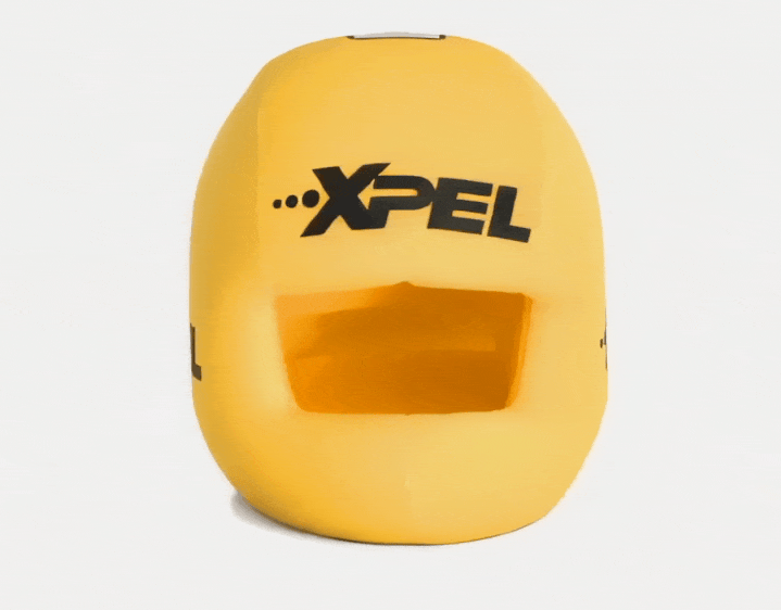


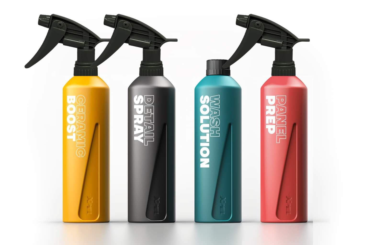
PRODUCT DESIGN: 16oz SPRAY BOTTLES
XPEL - 2024
Overview
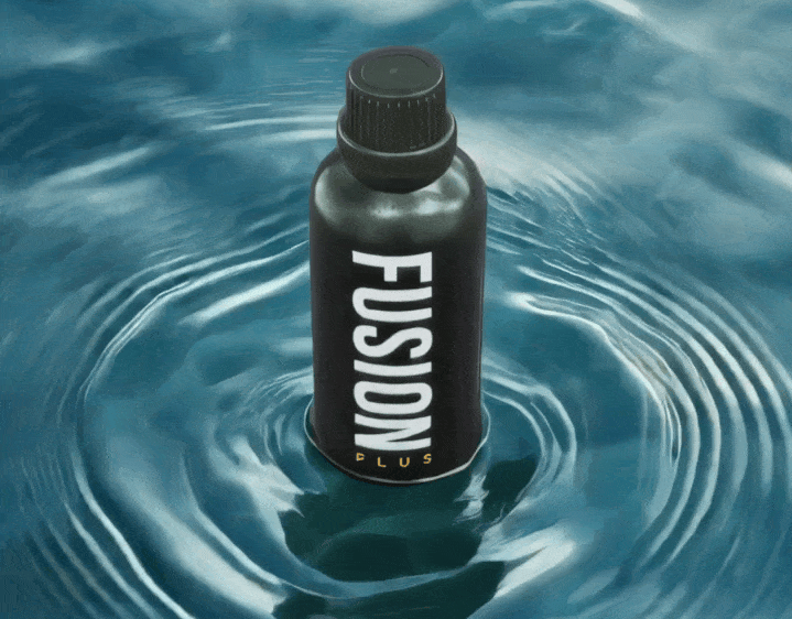
I collaborated with Product Management to design a unique, minimalist 16oz bottle for XPEL’s cleaning, chemical, and care product line. The goal was to develop a bottle that not only enhanced the brand’s visual identity but also improved product differentiation through a color-coded system—eliminating the inconsistent “taste the rainbow” effect caused by assigning random colors to each new product.
Beyond aesthetics, the design featured integrated branding in the mold, reinforcing a premium feel while ensuring consistency across product lines. I also developed the labeling system and overall visual layout, aligning it with the brand’s evolving identity.
Challenge
XPEL’s cleaning, chemical, and care product line needed a more cohesive and premium packaging design to elevate brand perception and streamline product differentiation. The previous system relied on randomized colors for each new product, leading to an inconsistent “taste the rainbow” effect.
The brand lacked a standardized bottle shape, making packaging less recognizable.
The labeling system needed a more modern and functional layout to improve legibility and consistency across product lines.
The labeling system needed a more modern and functional layout to improve legibility and consistency across product lines.
Solution
I worked closely with Product Management to develop a custom, minimalist bottle design featuring Integrated branding in the mold, reinforcing XPEL’s identity at the structural level.
A color-coded system that categorizes product types, eliminating the need to pick a new color for each release while improving brand consistency.
A modernized label layout, ensuring a premium yet functional design language that scales across different product types.
Outcome
The new bottle and labeling system were officially launched at the 2024 Dealer Conference, receiving positive feedback from dealers and industry professionals.
The design has since been expanded to additional product lines, including:
- 2oz sample sizes
- Polishing compounds
- Energy drinks and other branded products
My design direction also influenced the launch trailer produced by Studio Unknown, which helped modernize XPEL’s product marketing by shifting from real-world visuals to animated 3D models, motion graphics, and dynamic editing.
Toolset
This project combined traditional design methods with AI and digital tools. I used MidJourney to generate realistic concept renders, which were then converted into 3D .OBJ files using an image-to-3D tool. The final label designs were developed in Adobe Illustrator and Photoshop, while collaboration with the production team allowed for 3D printing and iteration. Throughout the process, I worked closely with Product Management and Production to ensure the final design met both aesthetic and functional requirements.
Next Steps
As the brand continues to refine its product presentation, I recommend expanding the color-coded system into future product releases and labeling systems, along with further optimizing the bottle mold based on real-world testing for ergonomic improvements. The modernized aesthetic established through this project will continue to evolve, ensuring a consistent and cohesive visual identity across all product lines.
Initial Product Packing Concept
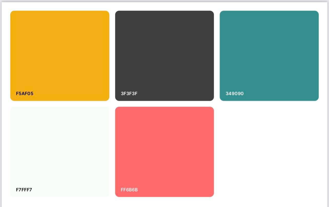
Developments in Color Palette
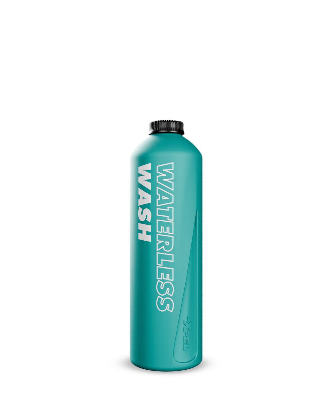
Production Render | Source: XPEL
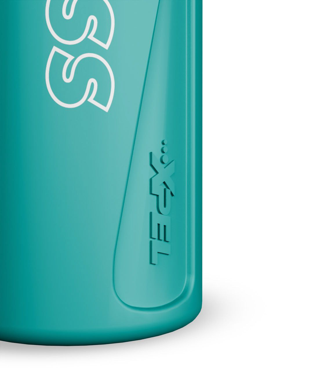
Branding Detail | Source: XPEL
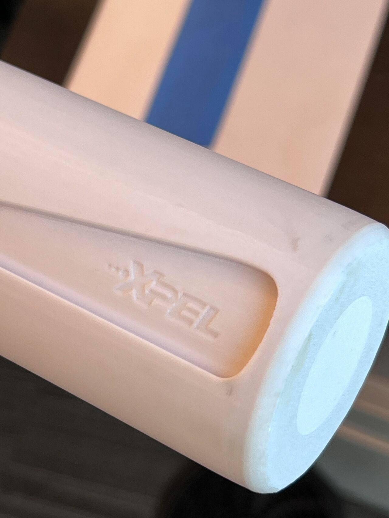
Early 3D Printed Bottle
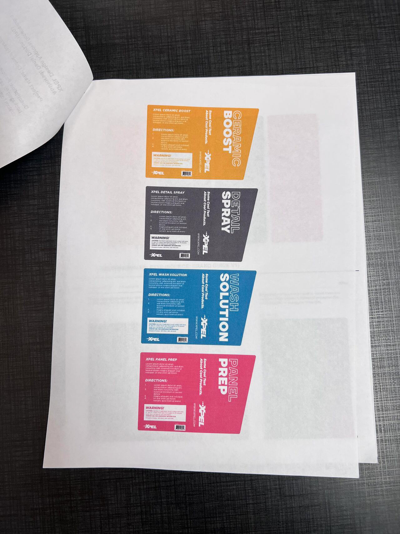
Label System Concepts
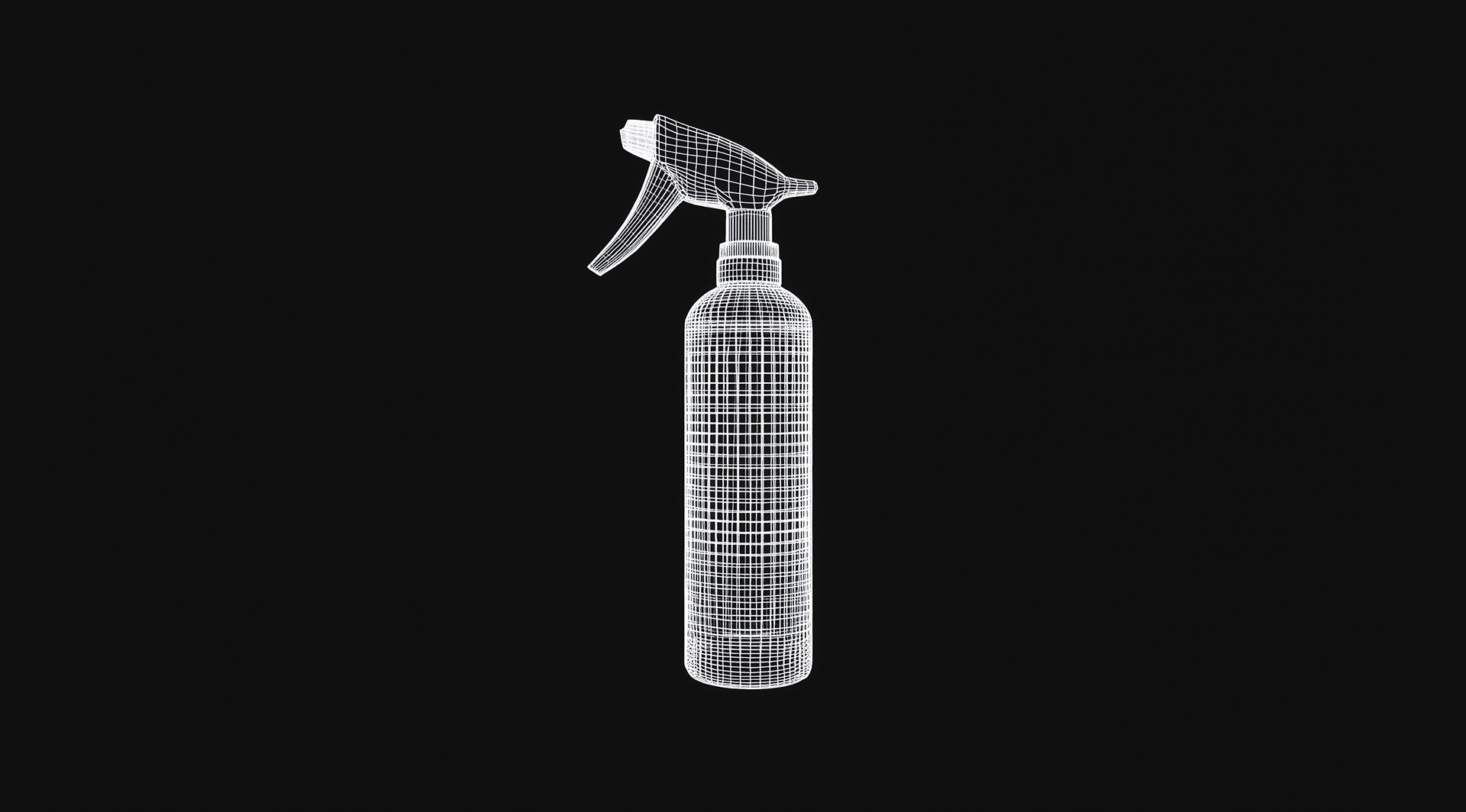
Bottle Concept Wireframe Render
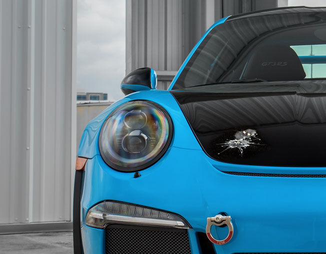
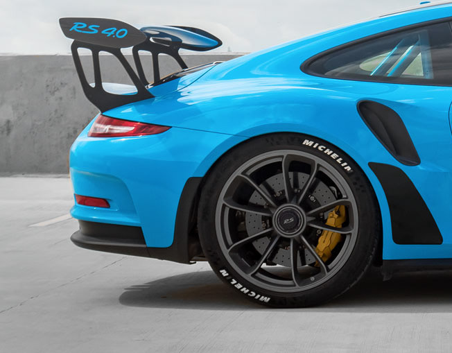
MEDIA DISCLAIMER: All XPEL product images, branding, and packaging designs are the property of XPEL, Inc. and are used here for portfolio purposes. Video assets, including the product launch trailer, were produced by Studio Unknown and are credited accordingly. Additional images or footage may be sourced from XPEL’s official marketing materials, website, and publicly available content. All rights remain with their respective owners.
If you are a rights holder and believe attribution needs adjustment, please contact mE DIRECTLY FOR ASSISTANCE.